Friday, December 26, 2025
Sunday, May 31, 2020
Monday, May 25, 2020
Home-based: Understand Element of Art - CONTRAST
 |
| This image is in reference to a Singapore Stamp design on traditional Dance |
To me, Contrast has always been one of the more challenging Element of Art to convey. It is the application of opposite elements for effect. In this example, I use lines (transformed into patterns) and solid segment.
Contrast can be achieved using Colours - Light vs Dark, Scale - Big vs Small and even Texture - Smooth vs Rough.
The following is a sequence shares one way to reach a basic composition with Contrast
Monday, May 11, 2020
Home-based: Apply Negative spaces
Negative spaces is the empty spaces around a subject. It is also the space in between subjects or objects.
Often, we regard positive spaces as the places the subject is coloured in. In the example, above, the line-drawing (one the left) has more negative spaces than the one with filled leaves (on the right).
Wednesday, May 6, 2020
Home-based: Understand Texture
Texture or visual texture add details and interest to any composition. For this activity, we will use an Owl as the subject.
When I plan an visual-texture exercise for beginners, I tend to lean towards the alphabets or numbers to help me to kick start the exercise. This is because learners are so familiar with alphabets and numbers. All we have to do is adjust the scale or position
Tuesday, April 28, 2020
Home-based: Understand Principle of Design - Variety
In the example below, Colour is the change.
In the example below, the Size/Scale is the change.
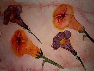
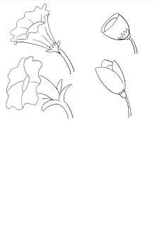
In this example below, two species of cup-shaped flower is the change.

How to draw different cup-shaped flowers. In the following step-by-step, there are six cup-shaped flowers:
Subscribe to:
Comments (Atom)


